
Bar plots
Barplots can be useful for comparing different treatments.
A good introduction on barplots is here.
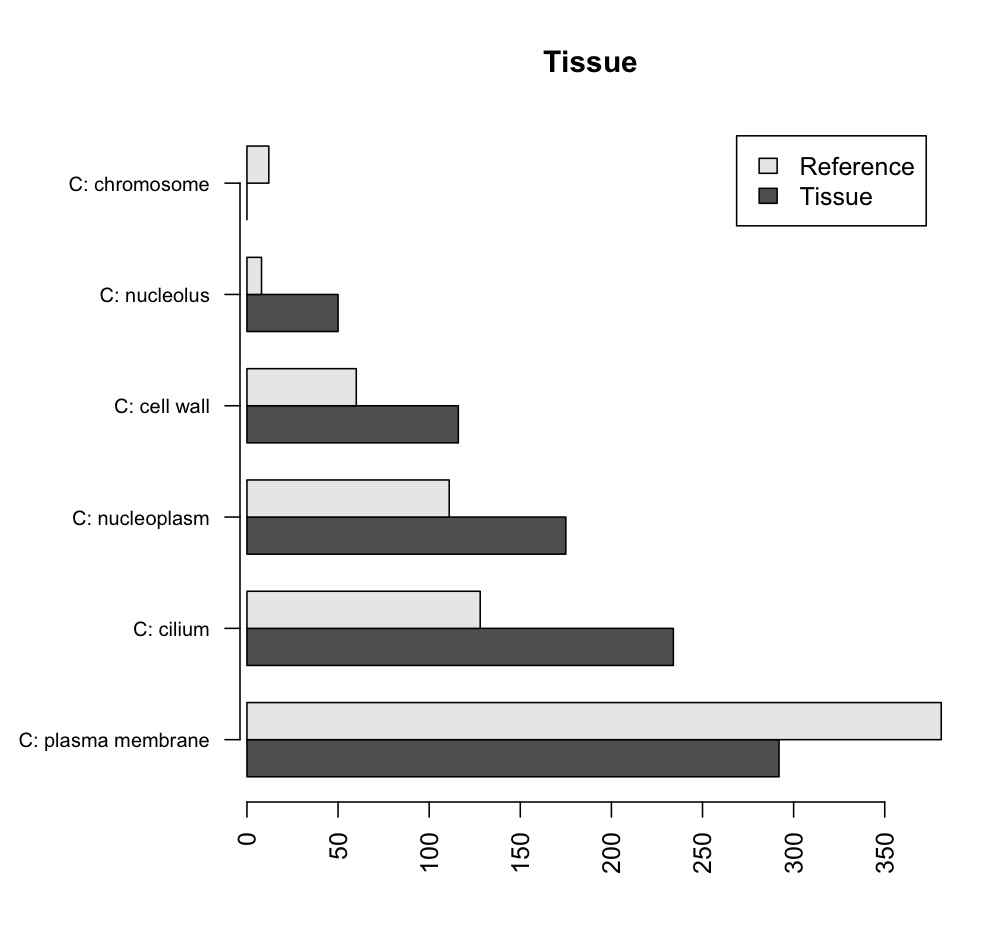
In the following example, I am plotting the results of a Fisher's exact test, made in Blast2GO, for significant differences in representation of GO terms between a tissue and the average of all tissues1.
The starting data, as exported from Blast2GO with some text manipulation2, might look like this:
testCount referenceCount
C: plasma membrane 292 381
C: cilium 50 8 C: nucleoplasm 234 128 C: cell wall 0 12
C: nucleolus 116 60
C: chromosome 175 111
We would like to retain the GO descriptions as readable text with the gaps, because they will be used in plotting. One way to do this, is to import the data in csv format. The above data would look like:
GO,testCount,referenceCount
C: plasma membrane,292,381
C: cilium,50,8
C: nucleoplasm,234,128
C: cell wall,0,12
C: nucleolus,116,60
C: chromosome,175,111
Read the data to R:
tissuedata <- read.csv("/Users/useraccount/Desktop/tissueData.csv", header=T, row.names=1)
The data display nicer if they are sorted. In the simplified example used here only one GO category is represented in the data (C, standing for Cellular Component):
sortedData <- data.frame(tissuedata[order(tissuedata$testCount+tissuedata$referenceCount, decreasing=T),])
If more are present in the data, sorting by an additional column representing those will result in a barplot subdivided by the GO categories (not shown).
The barplot can use a matrix as input, which is the imported data transposed:
tTissueTable <- data.frame(t(sortedData))
A simple input for a barplot is a matrix. A data frame is converted into a matrix with:
tissueMatrix <- as.matrix(tTissueTable)
R converts the spaces in the row names (now column names) to '.' for some reason. This is a problem when plotting. To deal with it, we replace the column names with no characters3:
colnames(tissueMatrix) <- gsub("."," ", colnames(tissueMatrix))
Since the text under the barcharts is important, the graph will look better with horizontal bars. To make the text at a right angle to the axis use:
par(las=2)
The description of each bar group may be longer than the default margin outside the graph. This is controlled (bottom, left, top, right) by:
par(mar=c(5,16,4,2))
Plot the matrix, with horizontal bars, each line of the matrix represented by a new bar beside the previous ones, control the description size and have a y axis line. Use the row names from the original data for that tissue.
barplot(tissueMatrix, horiz=T, main='Tissue', beside=T, cex.names=0.8, axis.lty=1, names.arg=row.names(tissuedata), legend=c('Tissue', 'Reference'))
The end result should look like this:
The example above is simplified. In a real situation, at least two tissues would be compared. All graphs could fit in the same figure using the following, before plotting:
par(mfrow=c(2,2)
Blast2GO produces such graphs, but for publication, or to ensure graphs from different tissues look similar, R has allows for more control over plotting.
In a mac terminal, the following code worked for me:
perl -pe 's/isotig.+//g ; s/GO\:/ag\tGO\:/g ; s/GO\-ID/Tissue\tGO\-ID/g ; s/TestSeqs+//g ; s/RefSeqs+//g' tissueFisherTable.txt > tissueTableForExcel.txt
The resulting file is manipulated in Excel further to replace commas with gaps, change column names to remove # and gaps and dashes, combine the results of different tissues into one (only one tissue shown in this post).
Overall, the real text file is more complicated than assumed in the post. ↑
Update on 10/05/2011
The graphs will probably look better if what is plotted is the percent of sequences of a given tissue that fall into a particular GO category. It is easy to make this calculation in R and replace the counts (used above) with the calculation output.